
Loading...

TravelSim App


Client

TravelSim by Top Connect

Design challenge

How might the recharging and purchasing processes be optimised for TravelSIM card abroad?
How to opportunistically introduce the new eSIM functionality to users?

Responsibility area

Concept generation based on business needs, UX and UI design. UX research and project management by Xhensila Reci.
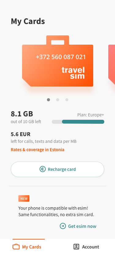

TravelSim gives frequent travellers an opportunity to save up to 80% on their roaming fees with SIM cards that work across continents. They offer both virtual (eSIM) and physical SIM cards. The goal of this project was to design an easy way for the users to manage their TravelSim cards from an app.
Available on iOS App Store and Google Play.
Technology

Progressive Web Application

Languages

English, French, Italian, German

Users

40 000 monthly

The biggest challenge with this project was effectively changing the existing purchase flow. There are many SIM packages to choose from and each one is highly customisable. Too many options at once and business-specific terminology made purchasing confusing. We hence deconstructed the previous business logic and designed a completely new flow with essentially the same options. The new solution limits the visible options with the steps now split apart. The question-and-answer format and improved copywriting contribute a long way too.
The client's market position is strong, as is their brand. So the design solution kept much of the symbolic orange and blue combination and used their logo as a way to bring a fun visual communicative element.