Loading...

RMK Mobile App


Client

State Forest Management Centre (RMK)

Design challenge

How might we enable a seamless explorative environment on a range of mobile devices?
How to make the UI clear and easy to read while being in nature, exposed to different weather conditions?
How to incorporate different destination types of the whole country in one app?

Responsibility area

User interface design, UX consultancy. Wireframes created by Katre Karja.
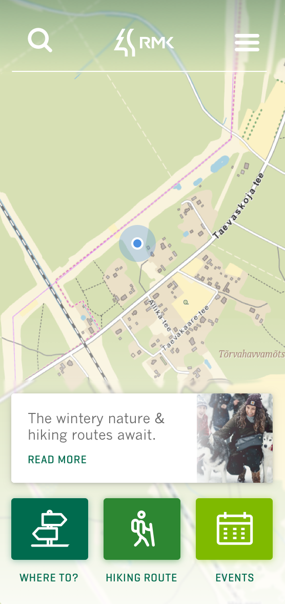

This app helps anyone interested in spending time in Estonian nature to find places and events to go to.
Find out more
Mobile view Available on iOS App Store and Google Play.
To all the nature lovers, hikers, and adventurers, exploring nature and events got significantly easier with the publishing of the new mobile app. Instead of having to research on a computer, they can access the app while on the go, even offline.
The app's simplicity is achieved by letting users search sights directly from the map, as is familiar to most of us from mainstream map apps. The map and its ease of use were thus the most critical part of the UI design. We aimed to reveal as much map area as possible.
Platforms

Android, iOS

Languages

Estonian, Russian, English

Users

Approx. 30 000

While minimal at a glance, the app is actually quite complex and a range of factors had to be considered when making it. For instance, it holds a great amount of information that reveals itself only when digging deeper. The prototype was tested with end-users to make sure all the navigation paths work. Moreover, the designs were adjusted to different mobile screen sizes and map types (satellite, terrain, etc). To make the important UI elements visible even in outdoor conditions, we used strong visual hierarchy and contrasts all across the app.